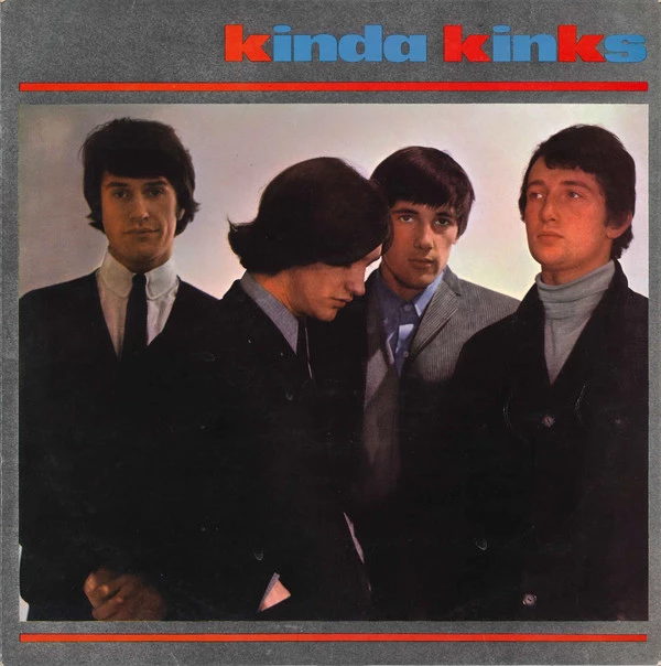
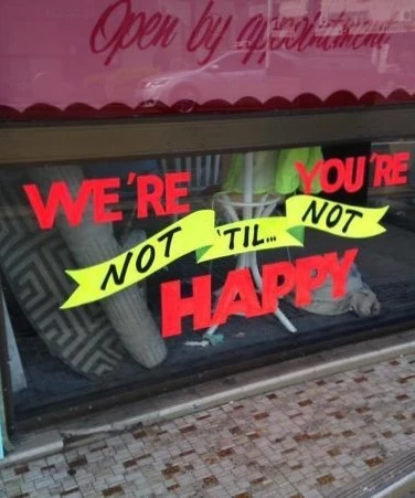
When a designer makes terrible typographical choices
Picking the right font is key to both the identity and legibility of a design. Our examples here show how picking the wrong font can completely change the meaning and intention behind your copywriting!
You should WHAT yourself?!

Probably wouldn't have blacked out those letters...

I love a good pie...

What did you just call me?

When not to use a Monogram
For well-known businesses such as NASA, or the NHS, monograms turn what would be a very complicated business name into a strong identity. These examples prove how sometimes it’s a much better idea to include your full name.
Not sure I'd like this nickname...

Those were not the best letters to highlight...

When not to obscure letters
I can immediately think of a few popular magazine cover designs who purposefully obscure their publication title with carefully cropped images. Usually, they are well known enough for this to work effectively. As demonstrated by these examples, sometimes you need to be very careful which letters you cover up.
The future is what?!

Well, that's not very nice...

When not to stack text
Stacking text can be a useful typographical approach when designing within a narrow working area, or when drawing attention to particular words. If you’re not careful though – as in the following examples – it can just be impossible to read your message!
It hurts my head reading this...

Who came up with this?

Where did they go so wrong?

You tried.

When UI design completely fails
UI/UX design has come to the forefront of the profession as a result of the dominance of digital in the last ten years or so. It’s really important to make sure your website is as easy to use as possible. Unlike these examples…
Aint nobody got time for this.

That password example!

Options?

Other
We found it hard/pointless to break down what went wrong with these last examples! They probably speak for themselves…

How did nobody question this?

How exactly is that braille going to help?

Fidget what?


