
With all of this, it didn’t come as any surprise to me that the Google brand was to be updated.
I say updated rather than new because the palette’s equity is retained. The previous four playful bright core colours still communicate that sense of playfulness, informality and creativity. Like Microsoft, Google’s use of this tetradic coloured palette evokes a simple expression of joy and happiness that allows us to feel at home using their systems or software - very clever!

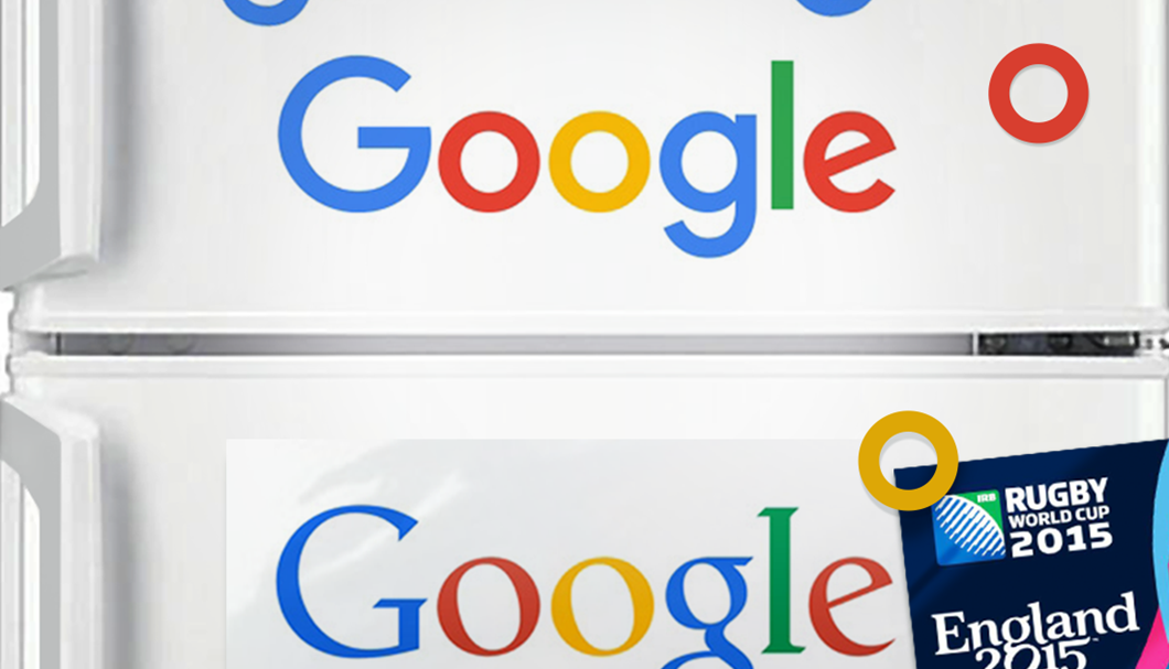
So what has really altered? Gone is the stuffy old serif word mark and welcome to the new, altogether more legible and contemporary Product Sans - a totally new typeface developed in-house. While many designers would probably argue that the serif word mark offered Google more of a distinctive look, my question is: “Why did it take so long to drop the unreliable ugly serif font?” I can only assume it is because many of us are now viewing it on mobile devices and this didn’t matter so much in the past. Could it be that the removal of the lower looped ‘g’ inspired the England 2015 World Rugby logo or was that just a coincidence? Either way, they both made a quick exit.

On the whole it feels simple, clean, fresh and still feels very much Google. Even their quirky DNA is retaining with a tilted ‘e’. Such is Google’s personality, vital for faceless mega-corporation such as Google. I condone Google’s bottom-up rebrand - it is how a great logo should be designed. Considering what works, improvements and how it could be adapted for use, such as the abridged ‘G’ logo that appears as the favicon.

Everything considered, I personally like the updated logo. Yet to my disappointment, I cannot take Google seriously - the more I look at it, the more it reminds me of fridge magnets.